
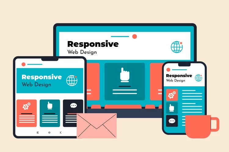
As technology evolves, the way users interact with websites continues to change. With smartphones, tablets, laptops, and even smartwatches accessing the internet, responsive design is no longer optional—it’s a necessity. A responsive website adapts seamlessly to different screen sizes, ensuring a consistent user experience across devices.
In this post, we’ll take a deep dive into the fundamentals, best practices, and advanced techniques for achieving exceptional responsive design.
1. The Importance of a Mobile-First Approach
A mobile-first strategy ensures that the core functionality and content of your website work efficiently on smaller screens before expanding to larger devices. Since mobile traffic dominates web usage, designing for mobile-first guarantees accessibility for a broad audience.
Key Strategy:
- Utilize flexible grids that can adjust dynamically.
- Prioritize simple, clear navigation to improve usability.
- Optimize page speed by reducing unnecessary scripts and excessive animations.
- Make typography scalable for readability across screens.
Real-World Example:
Google’s search algorithm prioritizes mobile-friendly websites, meaning a mobile-first approach can boost SEO rankings and improve user retention.
2. Fluid Layouts & Flexible Grids
Gone are the days of rigid, pixel-perfect layouts. Modern web development embraces fluid grids and flexible layouts, allowing content to adjust naturally to different resolutions.
Key Strategy:
- Implement CSS Grid for powerful, adaptable designs.
- Use Flexbox to efficiently align and distribute elements.
- Avoid fixed widths—use percentages or relative units like
vwandvhfor scalable designs.
Example Code Using CSS Grid:
.container {
  display: grid;
  grid-template-columns: repeat(auto-fit, minmax(300px, 1fr));
  gap: 20px;
}
This structure ensures that elements reflow smoothly while maintaining a visually appealing layout.
3. Mastering Media Queries for Adaptive Styling
CSS media queries define breakpoints, ensuring designs work across various screen sizes. They allow developers to modify styles based on conditions such as width, height, orientation, and resolution.
Key Strategy:
@media (max-width: 768px) {
  body {
    font-size: 14px;
    padding: 10px;
  }
}

@media (min-width: 1024px) {
  body {
    font-size: 18px;
    padding: 20px;
  }
}- Test multiple breakpoints to cover various device types.
- Prioritize readability and usability over complex aesthetic enhancements.
- Adapt images, typography, and spacing for better accessibility.
4. Optimizing Images for Performance & Responsiveness
Slow-loading images can hinder user experience, leading to higher bounce rates. Implement responsive images to maintain high performance without sacrificing quality.
Key Strategy:
- Utilize the
<picture>tag for adaptive image formats. - Compress images with tools like TinyPNG or Squoosh.
- Implement lazy loading using
loading="lazy"to defer image rendering.
Example Using Responsive Images:
<picture>
  <source srcset="image-large.jpg" media="(min-width: 1024px)">
  <source srcset="image-medium.jpg" media="(min-width: 768px)">
  <img src="image-small.jpg" alt="Responsive Image">
</picture>
This ensures users receive the optimal image resolution based on their screen size.
5. Creating Touch-Friendly Interfaces
Since mobile users interact via touchscreens, it’s crucial to design tap-friendly elements that improve accessibility.
Key Strategy:
- Buttons should have sufficient padding (at least 44px × 44px).
- Avoid hover-only interactions on mobile screens.
- Ensure links are spaced appropriately to prevent accidental clicks.
- Use CSS transitions to create smooth animations without excessive motion.
Example:
Instead of relying solely on hover effects, implement a tap-friendly design using JavaScript:
document.querySelector('.menu-button').addEventListener('click', function() {
  document.querySelector('.menu').classList.toggle('active');
});
6. Testing on Multiple Devices & Browsers
No matter how well a design looks on one device, real-world testing ensures that it works across multiple environments.
Key Strategy:
- Use browser testing tools like BrowserStack or LambdaTest.
- Conduct manual tests on physical devices to simulate real-world interactions.
- Gather user feedback and adjust based on insights.
Checklist for Responsive Testing:
✅ Mobile (iPhone, Android, Tablets)
✅ Desktop (Windows, MacOS)
✅ Multiple Screen Resolutions
✅ Portrait & Landscape Modes
✅ Cross-browser Compatibility
Final Thoughts
Responsive design is critical for modern websites. By implementing these principles, developers can create beautiful, functional websites that work across all devices. Whether you’re starting with a mobile-first approach, optimizing images, or refining your layouts, embracing responsive design leads to better usability, improved SEO, and enhanced user experiences.
What techniques do you use to ensure responsiveness? Drop your thoughts below!